The One That Got Away
A few years back, I met Pierre Cronje, the famous furniture maker, and I was hell bent on working for him. At the time, he did not want to change his logo as much as I wanted him to. I felt it lacked craftsmanship and heritage, both of which he had certainly earned his stripes for. Having toured his factory number of times, I was amazed at the skill and craft that went into every piece of furniture. The one table he was most well known for was his Bloukraans table, with its large under arch span.
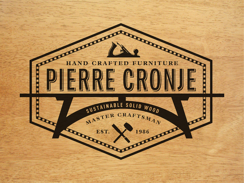
After hours of conversation, we came up with this piece of work for a new logo. I wanted him to stand apart from the newbies, and take hold of all the knowledge and craft he had worked so hard for. Never mind his love of sustainable wood either.
So In the middle of the proposed logo, you’ll find the Bloukraans table, surrounded by a wooden inlay of black and white squares. The tools hand drawn and positioned into a meaningful place above his name, and finished with 'Est. in 1986'. Everything we could think of went into protecting what he is most famous for, damn fine furniture that will undoubtably turn into family heirlooms.
Why did he get away? He was just not quite ready to make the move to a new logo and all that comes with rebranding i.e. business cards, signage delivery vehicles et al…and what pity it was!

